
We don’t always get things right first time, in the app. That’s why we listen to your feedback, as Flexers, to try and improve your experience.
And that’s what we’ve done with these little things – job cards.
Their purpose is to give you relevant information about an available job, and they appear throughout your time on the app; when browsing for jobs, when viewing jobs you’ve been offered, when viewing jobs you’ve applied for and jobs you’ve booked, and when looking to clock in and out of a shift
But, from what we’ve heard from you, you find them:
- A bit chunky
- Difficult to read
- Difficult to scroll past to see more jobs
- Difficult to know what to do next with i.e can you confirm shifts on them?
We’ve looked to fix those problems and go a bit further than that too.
Firstly, we’ve now changed things, so that when you browse jobs, you’ll be able to see up to 3.5 of the cards on your screen at any one time – less scrolling.
We’ve also made them less chunky and far easier to read.
And best of all, we’ve made the job cards more dynamic, so you know what to do at each stage in your job-hunting journey.
To be more specific, you’ll know when to tap the cards for the following actions/information:
- Which job you’ve got coming up next
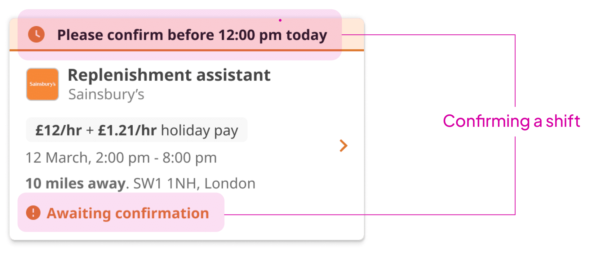
- Confirming a job
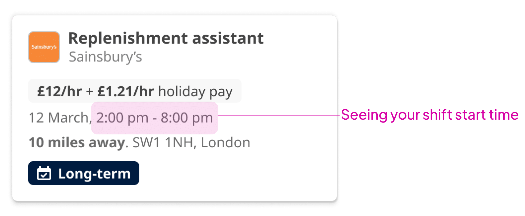
- Seeing your shift start time
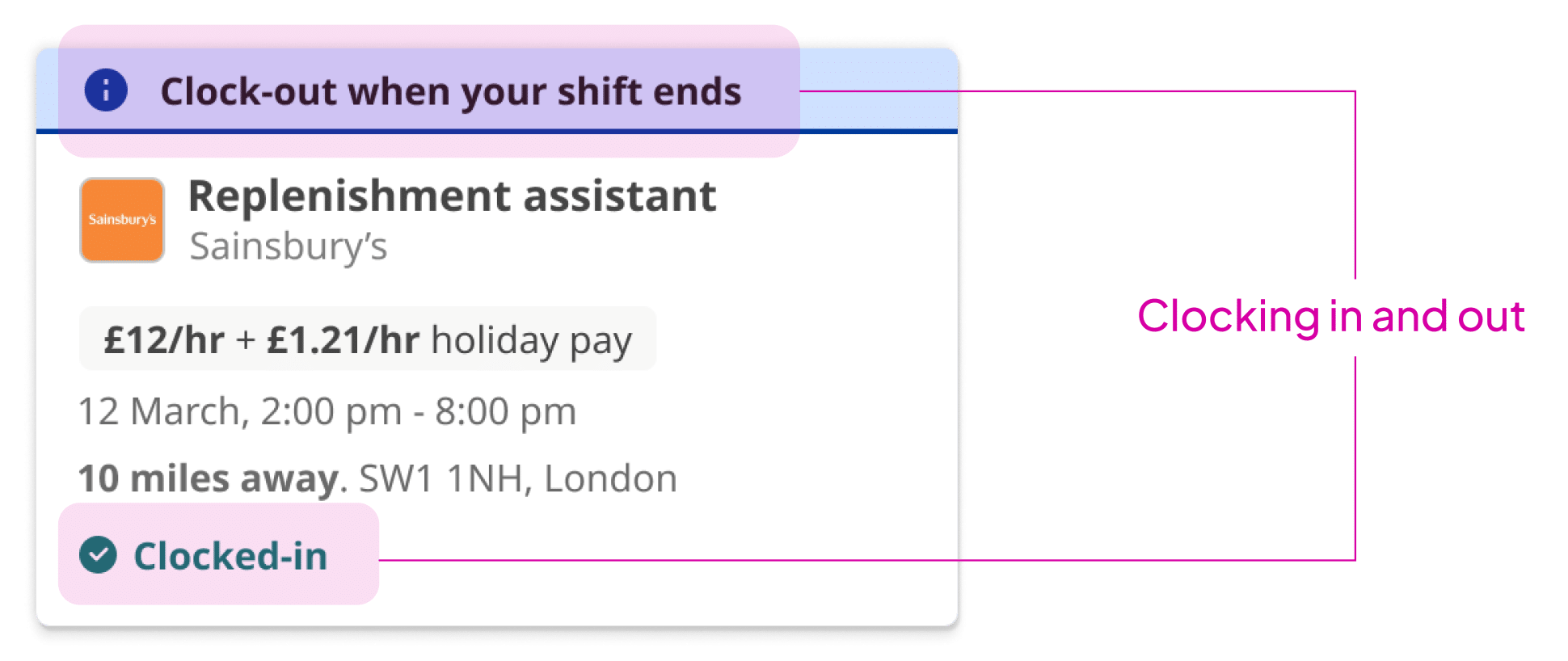
- Clocking in and out
We really hope these changes help when you’re navigating your way around the app and searching for jobs.
And we’d love to hear your feedback, so please take a minute to let us know, via the poll below, what you think of this new update.